class: center, top, title-slide # STAT 302, Lecture Slides 3 ## Data Visualization and Manipulation ### Bryan Martin --- # Outline 1. Introduction to tidyverse 2. Data Visualization 3. Data Manipulation .middler[**Goal:** Learn how to go from raw data to exploratory data analysis. (Project 1!)] --- class: inverse .sectionhead[Part 1: Introduction to tidyverse] --- layout: true # tidyverse --- The `tidyverse` is a collection of powerful R packages for data science. They include: * Reading and saving data: `readr` * Data manipulation: `tidyr`, `dplyr` * Data visualization: `ggplot2` * Working with different data structures: `tibble`, `purrr`, `stringr`, `forcats` You can install them all using ```r install.packages("tidyverse") ``` (Remember, you only need to do this once!) --- Load them all together in your workflow documents by calling ```r library(tidyverse) ``` ``` ## ── Attaching packages ─────────────────────────────────────── tidyverse 1.3.0 ── ``` ``` ## ✓ ggplot2 3.3.2 ✓ purrr 0.3.4 ## ✓ tibble 3.0.4 ✓ dplyr 1.0.2 ## ✓ tidyr 1.1.2 ✓ stringr 1.4.0 ## ✓ readr 1.4.0 ✓ forcats 0.5.0 ``` ``` ## ── Conflicts ────────────────────────────────────────── tidyverse_conflicts() ── ## x dplyr::filter() masks stats::filter() ## x dplyr::group_rows() masks kableExtra::group_rows() ## x dplyr::lag() masks stats::lag() ``` --- ## Conflicts? Recall that packages are essentially ways for you to install and use functions written by others. Occasionally, some of these functions have the same name and there is a conflict. Whichever package you load more recently using `library` will mask the old function, meaning that R will default to that version. In general, this is fine, especially with `tidyverse`. These package authors know when they have masked common functions in R, and typically we will prefer `tidyverse` version. The conflict message is to make sure you know about conflicts. You can (and should) hide this in your R Markdown files by adding the parameter `message=FALSE` or `include=FALSE` to your code chunk when you load packages. --- layout: false layout: true # Pipes --- .sectionhead[] --- **pipes** use the `%>%` operator to take the output from a previous function call and "pipe" it through to the next function. This can really help with readability of code when we use multiple nested functions! We will use the `gapminder` data from Jenny Bryan to demonstrate throughout this section. Load the package `gapminder` (after installing) and the corresponding data. ```r library(gapminder) data(gapminder) ``` Let's preview the data. ```r gapminder ``` ``` ## # A tibble: 1,704 x 6 ## country continent year lifeExp pop gdpPercap ## <fct> <fct> <int> <dbl> <int> <dbl> ## 1 Afghanistan Asia 1952 28.8 8425333 779. ## 2 Afghanistan Asia 1957 30.3 9240934 821. ## 3 Afghanistan Asia 1962 32.0 10267083 853. ## 4 Afghanistan Asia 1967 34.0 11537966 836. ## 5 Afghanistan Asia 1972 36.1 13079460 740. ## 6 Afghanistan Asia 1977 38.4 14880372 786. ## 7 Afghanistan Asia 1982 39.9 12881816 978. ## 8 Afghanistan Asia 1987 40.8 13867957 852. ## 9 Afghanistan Asia 1992 41.7 16317921 649. ## 10 Afghanistan Asia 1997 41.8 22227415 635. ## # … with 1,694 more rows ``` --- ## A brief note on factors ```r str(gapminder) ``` ``` ## tibble [1,704 × 6] (S3: tbl_df/tbl/data.frame) ## $ country : Factor w/ 142 levels "Afghanistan",..: 1 1 1 1 1 1 1 1 1 1 ... ## $ continent: Factor w/ 5 levels "Africa","Americas",..: 3 3 3 3 3 3 3 3 3 3 ... ## $ year : int [1:1704] 1952 1957 1962 1967 1972 1977 1982 1987 1992 1997 ... ## $ lifeExp : num [1:1704] 28.8 30.3 32 34 36.1 ... ## $ pop : int [1:1704] 8425333 9240934 10267083 11537966 13079460 14880372 12881816 13867957 16317921 22227415 ... ## $ gdpPercap: num [1:1704] 779 821 853 836 740 ... ``` **factors** are categorical data that use integer representation. This can be efficient to store character vectors, because each string is only entered once. Because of this, creating data frames (but not tibbles!) in R often default to set strings as factors. However, it can also get annoying! Factors limit the categories, or `levels`, of the vector, which is often not appropriate. I usually turn this off by setting the parameter `stringsAsFactors = FALSE` when I use `data.frame()`, unless I specifically want my data encoded as categorical. --- ## Functions in Functions What if we want the mean log population within our data set? Using base R, we might type ```r mean(log(gapminder$pop)) ``` ``` ## [1] 15.76611 ``` With pipes, we can use ```r gapminder$pop %>% log() %>% mean() ``` ``` ## [1] 15.76611 ``` Both of these are acceptable. However, when we start adding more and more functions, pipes can make your code much easier and more natural to read. --- layout: false # filtering data Very commonly, we will want to filter our data to restrict what we plot or analyze. For example, what if we are only interested in data from China since 1970? ```r china_1980 <- gapminder %>% filter(country == "China" & year >= 1970) china_1980 ``` ``` ## # A tibble: 8 x 6 ## country continent year lifeExp pop gdpPercap ## <fct> <fct> <int> <dbl> <int> <dbl> ## 1 China Asia 1972 63.1 862030000 677. ## 2 China Asia 1977 64.0 943455000 741. ## 3 China Asia 1982 65.5 1000281000 962. ## 4 China Asia 1987 67.3 1084035000 1379. ## 5 China Asia 1992 68.7 1164970000 1656. ## 6 China Asia 1997 70.4 1230075000 2289. ## 7 China Asia 2002 72.0 1280400000 3119. ## 8 China Asia 2007 73.0 1318683096 4959. ``` --- class: inverse .sectionhead[Part 2: Data Visualization] --- layout: true # Data Visualization --- `ggplot2` is a fantastic way to make complex publication quality<sup>1</sup> images without much pre-processing of your data. Plots are built sequentially using layers, so it's easy to edit and fine-tune the plots you generate. When using `ggplot2`, it is *essential* that your data are tidy! If they are not, the functions probably will not look like you expect. Let's work through how to build a plot layer by layer. .footnote[[1] or STAT302 Project quality] --- First, let's initialize a plot. Use the `data` parameter to tell `ggplot` what data frame to use. * It should be tidy data, in either a `data.frame` or `tibble`! .pull-left[ ```r *ggplot(data = gapminder) ``` ] .pull-right[ <!-- --> ] --- Add an aesthetic using the function `aes()` within the initial `ggplot()` call. * Controls our axes variables as well as graphical parameters such as color, size, shape .pull-left[ ```r ggplot(data = gapminder, * aes(x = year, y = lifeExp)) ``` ] .pull-right[ <!-- --> ] --- Now `ggplot` knows what to plot, but it doesn't know how to plot it yet. Let's add some points with `geom_point()`. * This is a new layer! We add layers using the `+` operator. .pull-left[ ```r ggplot(data = gapminder, aes(x = year, y = lifeExp)) + * geom_point() ``` ] .pull-right[ 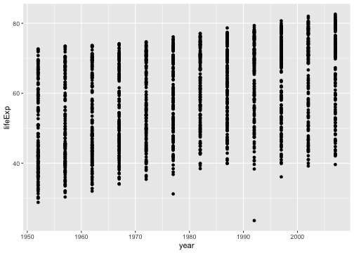<!-- --> ] --- Let's make our points smaller and red. .pull-left[ ```r ggplot(data = gapminder, aes(x = year, y = lifeExp)) + * geom_point(color = "red", size = 0.75) ``` ] .pull-right[ 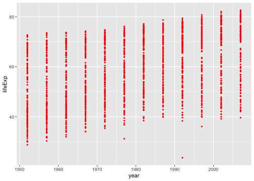<!-- --> ] --- Let's try switching them to lines. .pull-left[ ```r ggplot(data = gapminder, aes(x = year, y = lifeExp)) + * geom_line(color = "red", size = 0.75) ``` ] .pull-right[ 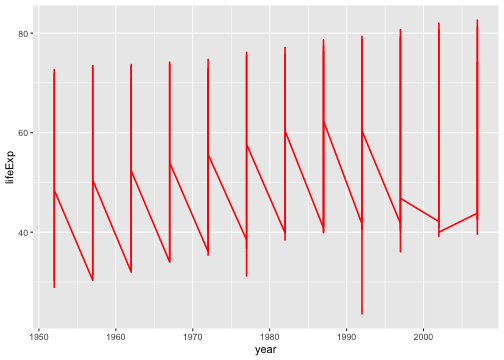<!-- --> ] --- We want lines connected by country, not just in the order they appear in the data. .pull-left[ ```r ggplot(data = gapminder, aes(x = year, y = lifeExp, * group = country)) + geom_line(color = "red", size = 0.5) ``` ] .pull-right[ 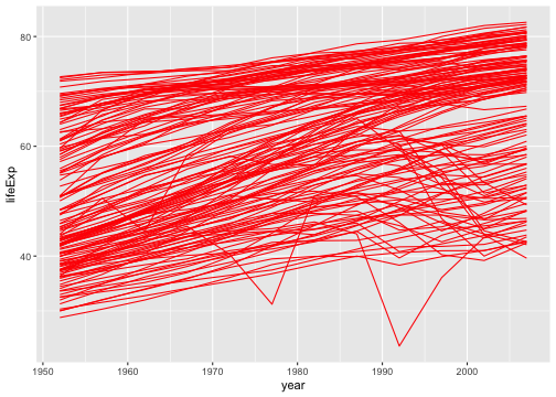<!-- --> ] --- We want to explore differences across continents, so let's color by continent * We use `aes()` because we want to color by something in our data * Putting a color within `aes()` will automatically add a label * We have to remove the color within `geom_line()`, or it will override the `aes()` .pull-left[ ```r ggplot(data = gapminder, aes(x = year, y = lifeExp, group = country, * color = continent)) + * geom_line(size = 0.5) ``` ] .pull-right[ 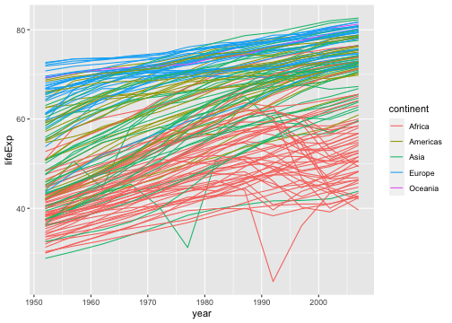<!-- --> ] --- Let's add another layer. Trendlines by continent! * We want them grouped differently than our lines (by continent), so we use a new `aes()` * We will make them stick out by having them be thicker and black * We don't want error bars, so we will remove `se` * We will use the default option `loess`. (See `?geom_smooth()`) .pull-left[ ```r ggplot(data = gapminder, aes(x = year, y = lifeExp, group = country, color = continent)) + geom_line(size = 0.5) + * geom_smooth(aes(group = continent), * se = FALSE, size = 1.5, * color = "black", * method = "loess") ``` ] .pull-right[ 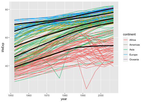<!-- --> ] --- This is cluttered and hard to read. Let's try separating by continents using **facets**! * We use `facet_wrap` * Takes in a **formula** object. Use a tilde `~` and then the variable name you want .pull-left[ ```r ggplot(data = gapminder, aes(x = year, y = lifeExp, group = country, color = continent)) + geom_line(size = 0.5) + geom_smooth(aes(group = continent), se = FALSE, size = 1.5, color = "black", method = "loess") + * facet_wrap(~ continent) ``` ] .pull-right[ 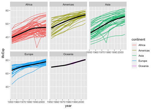<!-- --> ] --- Looking better! Now let's fine tune. First we'll formalize the labels on our plot using `labs()`. * Can also edit labels one at a time using `xlab()`, `ylab()`, `ggmain()`, ... * You should probably do this in every graph you present! Very rarely do you want the text styling of your data frame to match your output. Emphasis here on human readability! ```r ggplot(data = gapminder, aes(x = year, y = lifeExp, group = country, color = continent)) + geom_line(size = 0.5) + geom_smooth(aes(group = continent), se = FALSE, size = 1.5, color = "black", method = "loess") + facet_wrap(~ continent) + * labs(title = "Life expectancy over time by continent", * x = "Year", y = "Life Expectancy", * legend = "Continent") ``` --- .middler[ 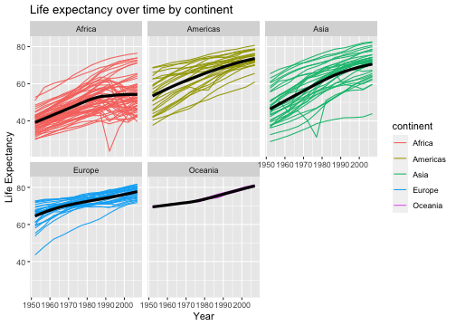<!-- --> ] --- Let's center our title by adjusting `theme()`. * `element_text()` tells ggplot how to display the text. Used for fine-tuning * `hjust` is our horizontal alignment, we set it to one half ```r ggplot(data = gapminder, aes(x = year, y = lifeExp, group = country, color = continent)) + geom_line(size = 0.5) + geom_smooth(aes(group = continent), se = FALSE, size = 1.5, color = "black", method = "loess") + facet_wrap(~ continent) + labs(title = "Life expectancy over time by continent", x = "Year", y = "Life Expectancy", legend = "Continent") + * theme(plot.title = element_text(hjust = 0.5, * face = "bold", * size = 14)) ``` --- .middler[ 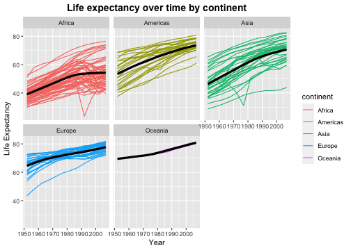<!-- --> ] --- Actually, that legend is redundant. Let's remove it. ```r ggplot(data = gapminder, aes(x = year, y = lifeExp, group = country, color = continent)) + geom_line(size = 0.5) + geom_smooth(aes(group = continent), se = FALSE, size = 1.5, color = "black", method = "loess") + facet_wrap(~ continent) + labs(title = "Life expectancy over time by continent", x = "Year", y = "Life Expectancy") + theme(plot.title = element_text(hjust = 0.5, face = "bold", size = 14), * legend.position = "none") ``` --- .middler[ 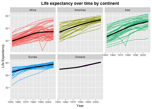<!-- --> ] --- I don't like the default gray background. I almost always set the `theme_bw()`. * There are several other theme options! Too many to list, so look them up if you want more options. ```r ggplot(data = gapminder, aes(x = year, y = lifeExp, group = country, color = continent)) + geom_line(size = 0.5) + geom_smooth(aes(group = continent), se = FALSE, size = 1.5, color = "black", method = "loess") + facet_wrap(~ continent) + labs(title = "Life expectancy over time by continent", x = "Year", y = "Life Expectancy") + theme(plot.title = element_text(hjust = 0.5, face = "bold", size = 14), legend.position = "none") + * theme_bw() ``` --- .middler[ 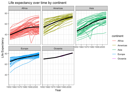<!-- --> ] --- This overwrote our custome `theme()` settings! Let's reorder the layers. ```r ggplot(data = gapminder, aes(x = year, y = lifeExp, group = country, color = continent)) + geom_line(size = 0.5) + geom_smooth(aes(group = continent), se = FALSE, size = 1.5, color = "black", method = "loess") + facet_wrap(~ continent) + labs(title = "Life expectancy over time by continent", x = "Year", y = "Life Expectancy") + * theme_bw() + * theme(plot.title = element_text(hjust = 0.5, face = "bold", size = 14), * legend.position = "none") ``` --- .middler[ 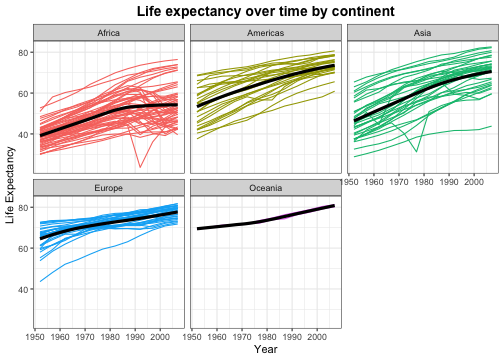<!-- --> ] --- We can make this more readable. Be careful of text that is too small! Let's increase all of our text proportionally using `base_size` within `theme_bw()`. * We could also do this by adjusting `text` within `theme()` * Note that we no longer need to manually adjust our title size. This will scale everything automatically. ```r ggplot(data = gapminder, aes(x = year, y = lifeExp, group = country, color = continent)) + geom_line(size = 0.5) + geom_smooth(aes(group = continent), se = FALSE, size = 1.5, color = "black", method = "loess") + facet_wrap(~ continent) + labs(title = "Life expectancy over time by continent", x = "Year", y = "Life Expectancy") + * theme_bw(base_size = 16) + * theme(plot.title = element_text(hjust = 0.5, face = "bold"), legend.position = "none") ``` --- .middler[ 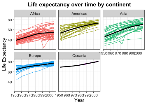<!-- --> ] --- Almost there! Now our text is a good size, but it overlaps. There are a few ways we could fix this. We'll rotate our text. ```r ggplot(data = gapminder, aes(x = year, y = lifeExp, group = country, color = continent)) + geom_line(size = 0.5) + geom_smooth(aes(group = continent), se = FALSE, size = 1.5, color = "black", method = "loess") + facet_wrap(~ continent) + labs(title = "Life expectancy over time by continent", x = "Year", y = "Life Expectancy") + theme_bw(base_size = 16) + theme(plot.title = element_text(hjust = 0.5, face = "bold"), legend.position = "none", * axis.text.x = element_text(angle = 45, hjust = 1, vjust = 1)) ``` --- .middler[ 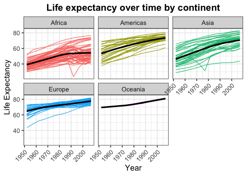<!-- --> ] --- Lastly, let's space out our panels by adjusting `panel.spacing.x`. ```r ggplot(data = gapminder, aes(x = year, y = lifeExp, group = country, color = continent)) + geom_line(size = 0.5) + geom_smooth(aes(group = continent), se = FALSE, size = 1.5, color = "black", method = "loess") + facet_wrap(~ continent) + labs(title = "Life expectancy over time by continent", x = "Year", y = "Life Expectancy") + theme_bw(base_size = 16) + theme(plot.title = element_text(hjust = 0.5, face = "bold"), legend.position = "none", axis.text.x = element_text(angle = 45, hjust = 1, vjust = 1), * panel.spacing.x = unit(0.75, "cm")) ``` --- .middler[ 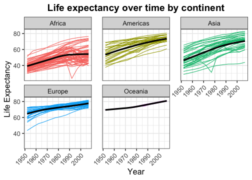<!-- --> ] --- Great, that looks good! Now we can store it as an object. ```r *lifeExp_plot <- ggplot(data = gapminder, aes(x = year, y = lifeExp, group = country, color = continent)) + geom_line(size = 0.5) + geom_smooth(aes(group = continent), se = FALSE, size = 1.5, color = "black", method = "loess") + facet_wrap(~ continent) + labs(title = "Life expectancy over time by continent", x = "Year", y = "Life Expectancy") + theme_bw(base_size = 16) + theme(plot.title = element_text(hjust = 0.5, face = "bold"), legend.position = "none", axis.text.x = element_text(angle = 45, hjust = 1, vjust = 1), panel.spacing.x = unit(0.75, "cm")) ``` --- Then we can plot it by just calling our object. ```r lifeExp_plot ``` .center[ <!-- --> ] --- We can also save it in our `Figures` subfolder using `ggsave()`. * Set `height` and `width` parameters to automatically resize the image ```r ggsave(filename = "Figures/lifeExp_plot.pdf", plot = lifeExp_plot, height = 5, width = 7) ``` .center[**Never** save a figure from your analysis using screenshots or point-and-click! They will be lower quality and non-reproducible!] --- ## Some comments on `ggplot`: * What we just made was a *very* complicated and fine-tuned plot! * I have to Google how to adjust certain things all the time * So does the creator of `ggplot2` .center[] --- ## A simpler example: Histogram .pull-left[ ```r *ggplot(data = gapminder, * aes(x = lifeExp)) ``` ] .pull-right[ <!-- --> ] --- ## A simpler example: Histogram .pull-left[ ```r ggplot(data = gapminder, aes(x = lifeExp)) + * geom_histogram() ``` ] .pull-right[ ``` ## `stat_bin()` using `bins = 30`. Pick better value with `binwidth`. ``` 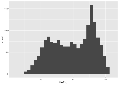<!-- --> ] --- ## A simpler example: Histogram .pull-left[ ```r ggplot(data = gapminder, aes(x = lifeExp)) + * geom_histogram(binwidth = 1) ``` ] .pull-right[ 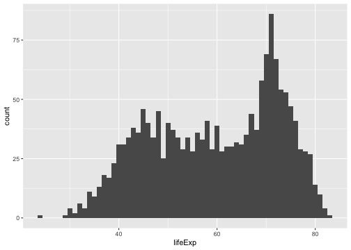<!-- --> ] --- ## A simpler example: Histogram .pull-left[ ```r ggplot(data = gapminder, aes(x = lifeExp)) + geom_histogram(binwidth = 1, * color = "black", * fill = "lightblue") ``` ] .pull-right[ 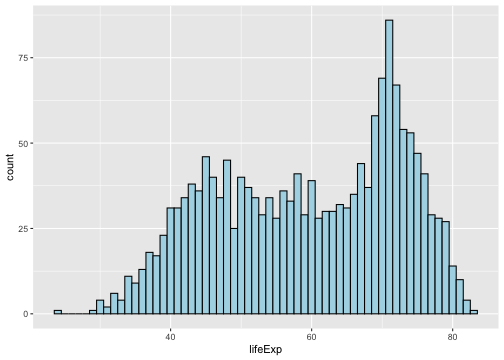<!-- --> ] --- ## A simpler example: Histogram .pull-left[ ```r ggplot(data = gapminder, aes(x = lifeExp)) + geom_histogram(binwidth = 1, color = "black", fill = "lightblue") + * theme_bw(base_size = 20) ``` ] .pull-right[ 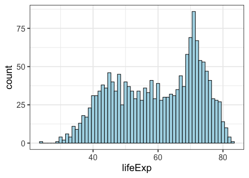<!-- --> ] --- ## A simpler example: Histogram .pull-left[ ```r ggplot(data = gapminder, aes(x = lifeExp)) + geom_histogram(binwidth = 1, color = "black", fill = "lightblue") + theme_bw(base_size = 20) + * labs(x = "Life Expectancy", * y = "Count") ``` ] .pull-right[ 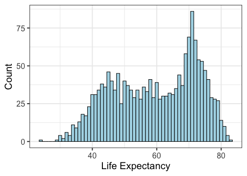<!-- --> ] --- ## A simpler example: Boxplots .pull-left[ ```r *ggplot(data = gapminder, * aes(x = continent, y = lifeExp)) ``` ] .pull-right[ <!-- --> ] --- ## A simpler example: Boxplots .pull-left[ ```r ggplot(data = gapminder, aes(x = continent, y = lifeExp)) + * geom_boxplot() ``` ] .pull-right[ 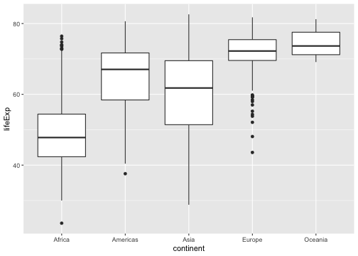<!-- --> ] --- ## A simpler example: Boxplots .pull-left[ ```r ggplot(data = gapminder, aes(x = continent, y = lifeExp)) + * geom_boxplot(fill = "lightblue") ``` ] .pull-right[ 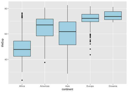<!-- --> ] --- ## A simpler example: Boxplots .pull-left[ ```r ggplot(data = gapminder, aes(x = continent, y = lifeExp)) + geom_boxplot(fill = "lightblue") + * theme_bw(base_size = 20) ``` ] .pull-right[ 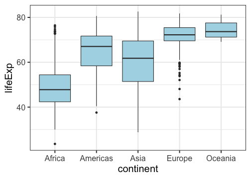<!-- --> ] --- ## A simpler example: Boxplots .pull-left[ ```r ggplot(data = gapminder, aes(x = continent, y = lifeExp)) + geom_boxplot(fill = "lightblue") + theme_bw(base_size = 20) + * labs(title = "Life expectancy by Continent", * x = "", * y = "") ``` ] .pull-right[ 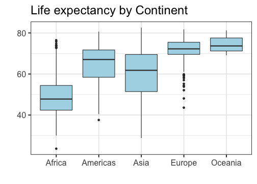<!-- --> ] --- ## A simpler example: Boxplots .pull-left[ ```r ggplot(data = gapminder, aes(x = continent, y = lifeExp)) + geom_boxplot(fill = "lightblue") + theme_bw(base_size = 20) + labs(title = "Life expectancy by Continent", x = "", y = "") + * theme(plot.title = * element_text(hjust = 0.5)) ``` ] .pull-right[ 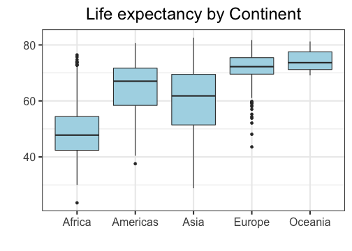<!-- --> ] --- ## A simpler example: Boxplots .pull-left[ ```r ggplot(data = gapminder, aes(x = continent, y = lifeExp)) + geom_boxplot(fill = "lightblue") + theme_bw(base_size = 20) + labs(title = "Life expectancy by Continent", x = "", y = "") + theme(plot.title = element_text(hjust = 0.5)) + * ylim(c(0, 85)) ``` ] .pull-right[ 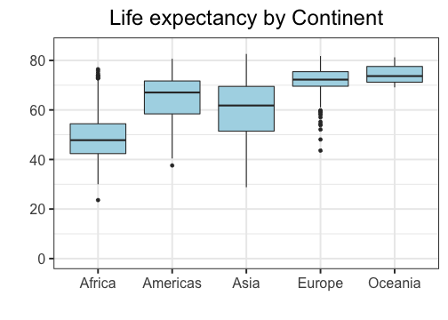<!-- --> ] --- .pull-left[## Don'ts * Pie graphs, ever * 3D plots * Deceptive axes * Excessive labels * Excessive/bad coloring * Fancy shading/effects * Bad variable/axis names * Unreadable labels * Overloaded with information ] .pull-right[## Do's * Simple, clean graphics * Neat and human readable text * Appropriate data range (bar charts should *always* start from 0!) * Consistent intervals * Roughly ~6 colors or less * Size figures appropriately ] --- layout: false layout: true # Bad Visualizations! --- .center[<img src="bad1.jpg" alt="" height="300"/>] -- **No-no:** Pie charts! Eugh! The proportions are completely off! .pull-right[.center[<img src="gag1.gif" alt="" height="200"/>]] --- .center[<img src="bad2.jpg" alt="" height="300"/>] -- **No-no:** Pie charts! Eugh! Percents don't add up! .pull-right[.center[<img src="gag2.gif" alt="" height="200"/>]] --- .center[<img src="bad3.png" alt="" height="300"/>] -- **No-no:** 3d bar charts?! .pull-right[.center[<img src="gag3.gif" alt="" height="200"/>]] --- .center[<img src="bad4.png" alt="" height="300"/>] -- **No-no:** Bad use of color .pull-right[.center[<img src="gag4.gif" alt="" height="200"/>]] --- .center[<img src="bad5.jpg" alt="" height="300"/>] -- **No-no:** Bad axis, lack of information, 3D bar chart .pull-right[.center[<img src="gag5.gif" alt="" height="200"/>]] --- .center[<img src="bad6.jpg" alt="" height="300"/>] -- **No-no:** Four numbers displayed as a cluttered chart, terrible labels, bad axis range .pull-right[.center[<img src="gag6.gif" alt="" height="200"/>]] --- .center[<img src="bad7.jpg" alt="" height="300"/>] -- **No-no:** Deceptively flipped y-axis! (and excessive color) .pull-right[.center[<img src="gag7.gif" alt="" height="200"/>]] --- .center[<img src="bad8.jpg" alt="" height="300"/>] .center[(This was presented in congress!)] -- **No-no:** Two axes in a single plot, bad axis range .pull-right[.center[<img src="gag8.gif" alt="" height="200"/>]] --- .center[<img src="bad9.png" alt="" height="300"/>] -- **No-no:** Deceptive axis range (should start at 0) .pull-right[.center[<img src="gag9.gif" alt="" height="200"/>]] --- .center[<img src="bad10.png" alt="" height="300"/>] .center[(From the Gates Foundation!)] -- **No-no:** Inconsistent x-axis intervals .pull-right[.center[<img src="gag10.gif" alt="" height="200"/>]] --- layout: false # ggplot cheatsheet * Axes: `xlim()`, `ylim()` * Legends: within initial `aes()`, edit within `theme()` or `guides()` * `geom_point()`, `geom_line()`, `geom_histogram()`, `geom_bar()`, `geom_boxplot()`, `geom_text()` * `facet_grid()`, `facet_wrap()` for faceting * `labs()` for labels * `theme_bw()` to make things look nicer * Graphical parameters: `color` for color, `alpha` for opacity, `lwd`/`size` for thickness, `shape` for shape, `fill` for interior color, ... .pushdown[.center[[Much, much more! (Click me for a cheat sheet!)](https://rstudio.com/wp-content/uploads/2015/03/ggplot2-cheatsheet.pdf)]] --- class: inverse .sectionhead[Part 3: Data Manipulation] --- layout: true # <TT>select()</TT>: Column selection --- Use `select()` to choose certain columns. ```r gapminder %>% select(lifeExp, gdpPercap) ``` ``` ## # A tibble: 1,704 x 2 ## lifeExp gdpPercap ## <dbl> <dbl> ## 1 28.8 779. ## 2 30.3 821. ## 3 32.0 853. ## 4 34.0 836. ## 5 36.1 740. ## 6 38.4 786. ## 7 39.9 978. ## 8 40.8 852. ## 9 41.7 649. ## 10 41.8 635. ## # … with 1,694 more rows ``` --- Use `select()` to choose certain columns. We can also use `select()` to remove certain columns by putting a `-` symbol in front. ```r gapminder %>% select(-lifeExp, -gdpPercap) ``` ``` ## # A tibble: 1,704 x 4 ## country continent year pop ## <fct> <fct> <int> <int> ## 1 Afghanistan Asia 1952 8425333 ## 2 Afghanistan Asia 1957 9240934 ## 3 Afghanistan Asia 1962 10267083 ## 4 Afghanistan Asia 1967 11537966 ## 5 Afghanistan Asia 1972 13079460 ## 6 Afghanistan Asia 1977 14880372 ## 7 Afghanistan Asia 1982 12881816 ## 8 Afghanistan Asia 1987 13867957 ## 9 Afghanistan Asia 1992 16317921 ## 10 Afghanistan Asia 1997 22227415 ## # … with 1,694 more rows ``` --- ## Helper functions `select()` has a number of helper functions to select columns (see `?select`). Notably: * `starts_with()` for prefixes * `ends_with()` for suffixes * `contains()` for strings ```r gapminder %>% select(starts_with("co")) %>% head() ``` ``` ## # A tibble: 6 x 2 ## country continent ## <fct> <fct> ## 1 Afghanistan Asia ## 2 Afghanistan Asia ## 3 Afghanistan Asia ## 4 Afghanistan Asia ## 5 Afghanistan Asia ## 6 Afghanistan Asia ``` --- ## Helper functions `select()` has a number of helper functions to select columns (see `?select`). Notably: * `starts_with()` for prefixes * `ends_with()` for suffixes * `contains()` for strings ```r gapminder %>% select(ends_with("p")) %>% head() ``` ``` ## # A tibble: 6 x 3 ## lifeExp pop gdpPercap ## <dbl> <int> <dbl> ## 1 28.8 8425333 779. ## 2 30.3 9240934 821. ## 3 32.0 10267083 853. ## 4 34.0 11537966 836. ## 5 36.1 13079460 740. ## 6 38.4 14880372 786. ``` --- ## Helper functions `select()` has a number of helper functions to select columns (see `?select`). Notably: * `starts_with()` for prefixes * `ends_with()` for suffixes * `contains()` for strings ```r gapminder %>% select(contains("Per")) %>% head() ``` ``` ## # A tibble: 6 x 1 ## gdpPercap ## <dbl> ## 1 779. ## 2 821. ## 3 853. ## 4 836. ## 5 740. ## 6 786. ``` --- ## Helper functions `select()` has a number of helper functions to select columns (see `?select`). Notably: * `starts_with()` for prefixes * `ends_with()` for suffixes * `contains()` for strings This can be particularly helpful when you have data in "wide" format! (such as `category_01`, `category_02`, `category_03`, ...) --- layout: false layout: true # <TT>mutate()</TT>: create new columns Create and transform variables from existing variables using `mutate()`. `mutate(NEW_VAR_NAME = ...)`. --- ```r gapminder %>% mutate(gdp = gdpPercap * pop) %>% head() ``` ``` ## # A tibble: 6 x 7 ## country continent year lifeExp pop gdpPercap gdp ## <fct> <fct> <int> <dbl> <int> <dbl> <dbl> ## 1 Afghanistan Asia 1952 28.8 8425333 779. 6567086330. ## 2 Afghanistan Asia 1957 30.3 9240934 821. 7585448670. ## 3 Afghanistan Asia 1962 32.0 10267083 853. 8758855797. ## 4 Afghanistan Asia 1967 34.0 11537966 836. 9648014150. ## 5 Afghanistan Asia 1972 36.1 13079460 740. 9678553274. ## 6 Afghanistan Asia 1977 38.4 14880372 786. 11697659231. ``` --- Note that we can use existing columns, including those we created within the same call to `mutate()`. ```r gapminder %>% mutate(gdp = gdpPercap * pop, logGDP = log(gdp)) %>% head() ``` ``` ## # A tibble: 6 x 8 ## country continent year lifeExp pop gdpPercap gdp logGDP ## <fct> <fct> <int> <dbl> <int> <dbl> <dbl> <dbl> ## 1 Afghanistan Asia 1952 28.8 8425333 779. 6567086330. 22.6 ## 2 Afghanistan Asia 1957 30.3 9240934 821. 7585448670. 22.7 ## 3 Afghanistan Asia 1962 32.0 10267083 853. 8758855797. 22.9 ## 4 Afghanistan Asia 1967 34.0 11537966 836. 9648014150. 23.0 ## 5 Afghanistan Asia 1972 36.1 13079460 740. 9678553274. 23.0 ## 6 Afghanistan Asia 1977 38.4 14880372 786. 11697659231. 23.2 ``` --- layout: false layout: true # <TT>ifelse()</TT>: conditional selection --- `ifelse()` takes in a logical test and conditional responses, and returns a vector of values based on the output of the test. It can be very useful for data cleaning (among other uses)! `ifelse(test, yes, no)` * `test`: the logical test * `yes`: return values for when `test` is `TRUE` * `no`: return values for when `test` is `FALSE` ```r demo <- -2:2 ifelse(demo > 0, "strictly positive", "not strictly positive") ``` ``` ## [1] "not strictly positive" "not strictly positive" "not strictly positive" ## [4] "strictly positive" "strictly positive" ``` --- `ifelse()` can be very useful within `mutate()`. For example, if we want to use the country code `USA` instead of `United States`, and store this variable as `country_clean`, we can use: ```r gapminder %>% mutate(country_clean = ifelse(country == "United States", "USA", as.character(country))) %>% filter(year == 2007, continent == "Americas") %>% select(country, country_clean, lifeExp, gdpPercap) %>% tail() ``` ``` ## # A tibble: 6 x 4 ## country country_clean lifeExp gdpPercap ## <fct> <chr> <dbl> <dbl> ## 1 Peru Peru 71.4 7409. ## 2 Puerto Rico Puerto Rico 78.7 19329. ## 3 Trinidad and Tobago Trinidad and Tobago 69.8 18009. ## 4 United States USA 78.2 42952. ## 5 Uruguay Uruguay 76.4 10611. ## 6 Venezuela Venezuela 73.7 11416. ``` --- layout: false layout: true # <TT>%in%</TT>: value matching `%in%` is a binary operator, which returns a boolean vector indicating whether components in the left-hand side are found in the right-hand side. --- ```r 1 %in% 1:5 ``` ``` ## [1] TRUE ``` ```r 1 %in% -1:-5 ``` ``` ## [1] FALSE ``` ```r c(0, 1, 2, 7) %in% 1:5 ``` ``` ## [1] FALSE TRUE TRUE FALSE ``` --- To negate the `%in%` operator, wrap the entire logical statement within `!(...)`. ```r !(1 %in% 1:5) ``` ``` ## [1] FALSE ``` ```r !(1 %in% -1:-5) ``` ``` ## [1] TRUE ``` ```r !(c(0, 1, 2, 7) %in% 1:5) ``` ``` ## [1] TRUE FALSE FALSE TRUE ``` --- ```r gapminder %>% filter(continent %in% c("Americas", "Europe")) %>% filter(year %in% c(2002, 2007)) %>% head() ``` ``` ## # A tibble: 6 x 6 ## country continent year lifeExp pop gdpPercap ## <fct> <fct> <int> <dbl> <int> <dbl> ## 1 Albania Europe 2002 75.7 3508512 4604. ## 2 Albania Europe 2007 76.4 3600523 5937. ## 3 Argentina Americas 2002 74.3 38331121 8798. ## 4 Argentina Americas 2007 75.3 40301927 12779. ## 5 Austria Europe 2002 79.0 8148312 32418. ## 6 Austria Europe 2007 79.8 8199783 36126. ``` --- layout: false layout: true # split-apply-combine --- *split-apply-combine* is a data analysis strategy where you *split* the data up into pieces, *apply* some operation on each piece, and then *combine* all the pieces back together. It's useful for breaking big problems into smaller manageable chunks! --- ## `group_by()` You can use `group_by()` to define a grouping of the rows of your data based on the columns. Notice that it doesn't change our data, except for that we can now see that it has 5 groups. ```r grouped_gap <- gapminder %>% group_by(continent) class(grouped_gap) ``` ``` ## [1] "grouped_df" "tbl_df" "tbl" "data.frame" ``` ```r grouped_gap ``` ``` ## # A tibble: 1,704 x 6 ## # Groups: continent [5] ## country continent year lifeExp pop gdpPercap ## <fct> <fct> <int> <dbl> <int> <dbl> ## 1 Afghanistan Asia 1952 28.8 8425333 779. ## 2 Afghanistan Asia 1957 30.3 9240934 821. ## 3 Afghanistan Asia 1962 32.0 10267083 853. ## 4 Afghanistan Asia 1967 34.0 11537966 836. ## 5 Afghanistan Asia 1972 36.1 13079460 740. ## 6 Afghanistan Asia 1977 38.4 14880372 786. ## 7 Afghanistan Asia 1982 39.9 12881816 978. ## 8 Afghanistan Asia 1987 40.8 13867957 852. ## 9 Afghanistan Asia 1992 41.7 16317921 649. ## 10 Afghanistan Asia 1997 41.8 22227415 635. ## # … with 1,694 more rows ``` --- ## `group_by()` You can use `group_by()` to define a grouping of the rows of your data based on the columns. We can remove the groups with `ungroup()`. ```r ungrouped_gap <- ungroup(grouped_gap) class(ungrouped_gap) ``` ``` ## [1] "tbl_df" "tbl" "data.frame" ``` ```r ungrouped_gap ``` ``` ## # A tibble: 1,704 x 6 ## country continent year lifeExp pop gdpPercap ## <fct> <fct> <int> <dbl> <int> <dbl> ## 1 Afghanistan Asia 1952 28.8 8425333 779. ## 2 Afghanistan Asia 1957 30.3 9240934 821. ## 3 Afghanistan Asia 1962 32.0 10267083 853. ## 4 Afghanistan Asia 1967 34.0 11537966 836. ## 5 Afghanistan Asia 1972 36.1 13079460 740. ## 6 Afghanistan Asia 1977 38.4 14880372 786. ## 7 Afghanistan Asia 1982 39.9 12881816 978. ## 8 Afghanistan Asia 1987 40.8 13867957 852. ## 9 Afghanistan Asia 1992 41.7 16317921 649. ## 10 Afghanistan Asia 1997 41.8 22227415 635. ## # … with 1,694 more rows ``` --- ## `summarize()` `summarize()` (or `summarise()`, if you prefer) will apply functions to rows of a data frame. If a data frame is grouped, the function will be applied by group. ```r gapminder %>% group_by(continent) %>% summarize(mean_lifeExp = mean(lifeExp, na.rm = TRUE), max_gdp = max(gdpPercap)) ``` ``` ## # A tibble: 5 x 3 ## continent mean_lifeExp max_gdp ## <fct> <dbl> <dbl> ## 1 Africa 48.9 21951. ## 2 Americas 64.7 42952. ## 3 Asia 60.1 113523. ## 4 Europe 71.9 49357. ## 5 Oceania 74.3 34435. ``` Notice that this creates an entirely new (and much smaller) data frame. Typically we want to store this object as a variable, but not as the same variable as our data! --- ## `arrange()` We can order the rows of the data using `arrange()`. Usually, you do this after some call to `summarize()`. ```r gapminder %>% group_by(continent) %>% summarize(mean_lifeExp = mean(lifeExp, na.rm = TRUE), max_gdp = max(gdpPercap)) %>% arrange(mean_lifeExp) ``` ``` ## # A tibble: 5 x 3 ## continent mean_lifeExp max_gdp ## <fct> <dbl> <dbl> ## 1 Africa 48.9 21951. ## 2 Asia 60.1 113523. ## 3 Americas 64.7 42952. ## 4 Europe 71.9 49357. ## 5 Oceania 74.3 34435. ``` --- ## `arrange()` We can order the rows of the data using `arrange()`. Usually, you do this after some call to `summarize()`. We can use `desc()` to put in decreasing order. ```r gapminder %>% group_by(continent) %>% summarize(mean_lifeExp = mean(lifeExp, na.rm = TRUE), max_gdp = max(gdpPercap)) %>% arrange(desc(mean_lifeExp)) ``` ``` ## # A tibble: 5 x 3 ## continent mean_lifeExp max_gdp ## <fct> <dbl> <dbl> ## 1 Oceania 74.3 34435. ## 2 Europe 71.9 49357. ## 3 Americas 64.7 42952. ## 4 Asia 60.1 113523. ## 5 Africa 48.9 21951. ``` --- ## `count()` If we want to count by groups, we can use the notation we've already earned. ```r gapminder %>% group_by(continent) %>% summarize(count = n()) ``` ``` ## # A tibble: 5 x 2 ## continent count ## <fct> <int> ## 1 Africa 624 ## 2 Americas 300 ## 3 Asia 396 ## 4 Europe 360 ## 5 Oceania 24 ``` --- ## `count()` Alternatively, we can use the shorthand `count()`, with optional argument `sort` to order. ```r gapminder %>% count(continent, sort = FALSE) ``` ``` ## # A tibble: 5 x 2 ## continent n ## <fct> <int> ## 1 Africa 624 ## 2 Americas 300 ## 3 Asia 396 ## 4 Europe 360 ## 5 Oceania 24 ``` --- ## `count()` We can also count combinations of categories by supplying multiple variables to `count()`. ```r gapminder %>% count(continent, country) ``` ``` ## # A tibble: 142 x 3 ## continent country n ## <fct> <fct> <int> ## 1 Africa Algeria 12 ## 2 Africa Angola 12 ## 3 Africa Benin 12 ## 4 Africa Botswana 12 ## 5 Africa Burkina Faso 12 ## 6 Africa Burundi 12 ## 7 Africa Cameroon 12 ## 8 Africa Central African Republic 12 ## 9 Africa Chad 12 ## 10 Africa Comoros 12 ## # … with 132 more rows ``` --- ## `count()` We can also count combinations of categories by supplying multiple variables to `count()`, we can then sort using `arrange()`. ```r gapminder %>% count(continent, country) %>% arrange(country, desc(n)) ``` ``` ## # A tibble: 142 x 3 ## continent country n ## <fct> <fct> <int> ## 1 Asia Afghanistan 12 ## 2 Europe Albania 12 ## 3 Africa Algeria 12 ## 4 Africa Angola 12 ## 5 Americas Argentina 12 ## 6 Oceania Australia 12 ## 7 Europe Austria 12 ## 8 Asia Bahrain 12 ## 9 Asia Bangladesh 12 ## 10 Europe Belgium 12 ## # … with 132 more rows ``` --- layout:false # <TT>pull()</TT>: extract column as vector You can use `pull()` to extract a single column as a vector. Notice the difference between ```r gapminder %>% select(lifeExp) %>% head(4) ``` ``` ## # A tibble: 4 x 1 ## lifeExp ## <dbl> ## 1 28.8 ## 2 30.3 ## 3 32.0 ## 4 34.0 ``` ```r gapminder %>% pull(lifeExp) %>% head(10) ``` ``` ## [1] 28.801 30.332 31.997 34.020 36.088 38.438 39.854 40.822 41.674 41.763 ``` --- # <TT>rename()</TT>: ...renaming! `rename(data, NEW_VAR_NAME = OLD_VAR_NAME)` ```r gapminder %>% rename(life_exp = lifeExp) ``` ``` ## # A tibble: 1,704 x 6 ## country continent year life_exp pop gdpPercap ## <fct> <fct> <int> <dbl> <int> <dbl> ## 1 Afghanistan Asia 1952 28.8 8425333 779. ## 2 Afghanistan Asia 1957 30.3 9240934 821. ## 3 Afghanistan Asia 1962 32.0 10267083 853. ## 4 Afghanistan Asia 1967 34.0 11537966 836. ## 5 Afghanistan Asia 1972 36.1 13079460 740. ## 6 Afghanistan Asia 1977 38.4 14880372 786. ## 7 Afghanistan Asia 1982 39.9 12881816 978. ## 8 Afghanistan Asia 1987 40.8 13867957 852. ## 9 Afghanistan Asia 1992 41.7 16317921 649. ## 10 Afghanistan Asia 1997 41.8 22227415 635. ## # … with 1,694 more rows ``` --- layout: true # Re-arranging Data --- ## `pivot_longer()` Let's load the `relig_income` data from tidyverse. ```r data(relig_income) head(relig_income) ``` ``` ## # A tibble: 6 x 11 ## religion `<$10k` `$10-20k` `$20-30k` `$30-40k` `$40-50k` `$50-75k` `$75-100k` ## <chr> <dbl> <dbl> <dbl> <dbl> <dbl> <dbl> <dbl> ## 1 Agnostic 27 34 60 81 76 137 122 ## 2 Atheist 12 27 37 52 35 70 73 ## 3 Buddhist 27 21 30 34 33 58 62 ## 4 Catholic 418 617 732 670 638 1116 949 ## 5 Don’t k… 15 14 15 11 10 35 21 ## 6 Evangel… 575 869 1064 982 881 1486 949 ## # … with 3 more variables: `$100-150k` <dbl>, `>150k` <dbl>, `Don't ## # know/refused` <dbl> ``` --- ## `pivot_longer()` We can use `pivot_longer()` to go from data in "wide" form to data in "long" form. ```r relig_income %>% pivot_longer(contains("$"), names_to = "income", values_to = "count") ``` ``` ## # A tibble: 144 x 5 ## religion `>150k` `Don't know/refused` income count ## <chr> <dbl> <dbl> <chr> <dbl> ## 1 Agnostic 84 96 <$10k 27 ## 2 Agnostic 84 96 $10-20k 34 ## 3 Agnostic 84 96 $20-30k 60 ## 4 Agnostic 84 96 $30-40k 81 ## 5 Agnostic 84 96 $40-50k 76 ## 6 Agnostic 84 96 $50-75k 137 ## 7 Agnostic 84 96 $75-100k 122 ## 8 Agnostic 84 96 $100-150k 109 ## 9 Atheist 74 76 <$10k 12 ## 10 Atheist 74 76 $10-20k 27 ## # … with 134 more rows ``` --- ## `pivot_longer()` Looks like we missed a few of the income column names. Let's use matches with a regular expression. ```r relig_income %>% pivot_longer(matches("\\$|150|refused"), names_to = "income", values_to = "count") ``` ``` ## # A tibble: 180 x 3 ## religion income count ## <chr> <chr> <dbl> ## 1 Agnostic <$10k 27 ## 2 Agnostic $10-20k 34 ## 3 Agnostic $20-30k 60 ## 4 Agnostic $30-40k 81 ## 5 Agnostic $40-50k 76 ## 6 Agnostic $50-75k 137 ## 7 Agnostic $75-100k 122 ## 8 Agnostic $100-150k 109 ## 9 Agnostic >150k 84 ## 10 Agnostic Don't know/refused 96 ## # … with 170 more rows ``` --- ## `pivot_longer()` Let's load the `billboard` data from tidyverse. ```r data(billboard) billboard ``` ``` ## # A tibble: 317 x 79 ## artist track date.entered wk1 wk2 wk3 wk4 wk5 wk6 wk7 wk8 ## <chr> <chr> <date> <dbl> <dbl> <dbl> <dbl> <dbl> <dbl> <dbl> <dbl> ## 1 2 Pac Baby… 2000-02-26 87 82 72 77 87 94 99 NA ## 2 2Ge+h… The … 2000-09-02 91 87 92 NA NA NA NA NA ## 3 3 Doo… Kryp… 2000-04-08 81 70 68 67 66 57 54 53 ## 4 3 Doo… Loser 2000-10-21 76 76 72 69 67 65 55 59 ## 5 504 B… Wobb… 2000-04-15 57 34 25 17 17 31 36 49 ## 6 98^0 Give… 2000-08-19 51 39 34 26 26 19 2 2 ## 7 A*Tee… Danc… 2000-07-08 97 97 96 95 100 NA NA NA ## 8 Aaliy… I Do… 2000-01-29 84 62 51 41 38 35 35 38 ## 9 Aaliy… Try … 2000-03-18 59 53 38 28 21 18 16 14 ## 10 Adams… Open… 2000-08-26 76 76 74 69 68 67 61 58 ## # … with 307 more rows, and 68 more variables: wk9 <dbl>, wk10 <dbl>, ## # wk11 <dbl>, wk12 <dbl>, wk13 <dbl>, wk14 <dbl>, wk15 <dbl>, wk16 <dbl>, ## # wk17 <dbl>, wk18 <dbl>, wk19 <dbl>, wk20 <dbl>, wk21 <dbl>, wk22 <dbl>, ## # wk23 <dbl>, wk24 <dbl>, wk25 <dbl>, wk26 <dbl>, wk27 <dbl>, wk28 <dbl>, ## # wk29 <dbl>, wk30 <dbl>, wk31 <dbl>, wk32 <dbl>, wk33 <dbl>, wk34 <dbl>, ## # wk35 <dbl>, wk36 <dbl>, wk37 <dbl>, wk38 <dbl>, wk39 <dbl>, wk40 <dbl>, ## # wk41 <dbl>, wk42 <dbl>, wk43 <dbl>, wk44 <dbl>, wk45 <dbl>, wk46 <dbl>, ## # wk47 <dbl>, wk48 <dbl>, wk49 <dbl>, wk50 <dbl>, wk51 <dbl>, wk52 <dbl>, ## # wk53 <dbl>, wk54 <dbl>, wk55 <dbl>, wk56 <dbl>, wk57 <dbl>, wk58 <dbl>, ## # wk59 <dbl>, wk60 <dbl>, wk61 <dbl>, wk62 <dbl>, wk63 <dbl>, wk64 <dbl>, ## # wk65 <dbl>, wk66 <lgl>, wk67 <lgl>, wk68 <lgl>, wk69 <lgl>, wk70 <lgl>, ## # wk71 <lgl>, wk72 <lgl>, wk73 <lgl>, wk74 <lgl>, wk75 <lgl>, wk76 <lgl> ``` --- ## `pivot_longer()` ```r billboard %>% pivot_longer( cols = starts_with("wk"), names_to = "week", names_prefix = "wk", values_to = "rank", values_drop_na = TRUE ) ``` ``` ## # A tibble: 5,307 x 5 ## artist track date.entered week rank ## <chr> <chr> <date> <chr> <dbl> ## 1 2 Pac Baby Don't Cry (Keep... 2000-02-26 1 87 ## 2 2 Pac Baby Don't Cry (Keep... 2000-02-26 2 82 ## 3 2 Pac Baby Don't Cry (Keep... 2000-02-26 3 72 ## 4 2 Pac Baby Don't Cry (Keep... 2000-02-26 4 77 ## 5 2 Pac Baby Don't Cry (Keep... 2000-02-26 5 87 ## 6 2 Pac Baby Don't Cry (Keep... 2000-02-26 6 94 ## 7 2 Pac Baby Don't Cry (Keep... 2000-02-26 7 99 ## 8 2Ge+her The Hardest Part Of ... 2000-09-02 1 91 ## 9 2Ge+her The Hardest Part Of ... 2000-09-02 2 87 ## 10 2Ge+her The Hardest Part Of ... 2000-09-02 3 92 ## # … with 5,297 more rows ``` --- ## `pivot_wider()` Let's load the `fish_encounters` data from tidyverse. ```r data(fish_encounters) head(fish_encounters) ``` ``` ## # A tibble: 6 x 3 ## fish station seen ## <fct> <fct> <int> ## 1 4842 Release 1 ## 2 4842 I80_1 1 ## 3 4842 Lisbon 1 ## 4 4842 Rstr 1 ## 5 4842 Base_TD 1 ## 6 4842 BCE 1 ``` --- ## `pivot_wider()` We can use `pivot_wider()` to go from data in "long" form to data in "wide" form. ```r fish_encounters %>% pivot_wider(names_from = station, values_from = seen) ``` ``` ## # A tibble: 19 x 12 ## fish Release I80_1 Lisbon Rstr Base_TD BCE BCW BCE2 BCW2 MAE MAW ## <fct> <int> <int> <int> <int> <int> <int> <int> <int> <int> <int> <int> ## 1 4842 1 1 1 1 1 1 1 1 1 1 1 ## 2 4843 1 1 1 1 1 1 1 1 1 1 1 ## 3 4844 1 1 1 1 1 1 1 1 1 1 1 ## 4 4845 1 1 1 1 1 NA NA NA NA NA NA ## 5 4847 1 1 1 NA NA NA NA NA NA NA NA ## 6 4848 1 1 1 1 NA NA NA NA NA NA NA ## 7 4849 1 1 NA NA NA NA NA NA NA NA NA ## 8 4850 1 1 NA 1 1 1 1 NA NA NA NA ## 9 4851 1 1 NA NA NA NA NA NA NA NA NA ## 10 4854 1 1 NA NA NA NA NA NA NA NA NA ## 11 4855 1 1 1 1 1 NA NA NA NA NA NA ## 12 4857 1 1 1 1 1 1 1 1 1 NA NA ## 13 4858 1 1 1 1 1 1 1 1 1 1 1 ## 14 4859 1 1 1 1 1 NA NA NA NA NA NA ## 15 4861 1 1 1 1 1 1 1 1 1 1 1 ## 16 4862 1 1 1 1 1 1 1 1 1 NA NA ## 17 4863 1 1 NA NA NA NA NA NA NA NA NA ## 18 4864 1 1 NA NA NA NA NA NA NA NA NA ## 19 4865 1 1 1 NA NA NA NA NA NA NA NA ``` --- ## `pivot_wider()` ```r fish_encounters %>% pivot_wider( names_from = station, values_from = seen, values_fill = list(seen = 0) ) ``` ``` ## # A tibble: 19 x 12 ## fish Release I80_1 Lisbon Rstr Base_TD BCE BCW BCE2 BCW2 MAE MAW ## <fct> <int> <int> <int> <int> <int> <int> <int> <int> <int> <int> <int> ## 1 4842 1 1 1 1 1 1 1 1 1 1 1 ## 2 4843 1 1 1 1 1 1 1 1 1 1 1 ## 3 4844 1 1 1 1 1 1 1 1 1 1 1 ## 4 4845 1 1 1 1 1 0 0 0 0 0 0 ## 5 4847 1 1 1 0 0 0 0 0 0 0 0 ## 6 4848 1 1 1 1 0 0 0 0 0 0 0 ## 7 4849 1 1 0 0 0 0 0 0 0 0 0 ## 8 4850 1 1 0 1 1 1 1 0 0 0 0 ## 9 4851 1 1 0 0 0 0 0 0 0 0 0 ## 10 4854 1 1 0 0 0 0 0 0 0 0 0 ## 11 4855 1 1 1 1 1 0 0 0 0 0 0 ## 12 4857 1 1 1 1 1 1 1 1 1 0 0 ## 13 4858 1 1 1 1 1 1 1 1 1 1 1 ## 14 4859 1 1 1 1 1 0 0 0 0 0 0 ## 15 4861 1 1 1 1 1 1 1 1 1 1 1 ## 16 4862 1 1 1 1 1 1 1 1 1 0 0 ## 17 4863 1 1 0 0 0 0 0 0 0 0 0 ## 18 4864 1 1 0 0 0 0 0 0 0 0 0 ## 19 4865 1 1 1 0 0 0 0 0 0 0 0 ``` --- ## `pivot_wider()` Let's load the `us_rent_income` data from tidyverse. ```r data(us_rent_income) head(us_rent_income) ``` ``` ## # A tibble: 6 x 5 ## GEOID NAME variable estimate moe ## <chr> <chr> <chr> <dbl> <dbl> ## 1 01 Alabama income 24476 136 ## 2 01 Alabama rent 747 3 ## 3 02 Alaska income 32940 508 ## 4 02 Alaska rent 1200 13 ## 5 04 Arizona income 27517 148 ## 6 04 Arizona rent 972 4 ``` --- ## `pivot_wider()` ```r us_rent_income %>% pivot_wider(names_from = variable, values_from = c(estimate, moe)) ``` ``` ## # A tibble: 52 x 6 ## GEOID NAME estimate_income estimate_rent moe_income moe_rent ## <chr> <chr> <dbl> <dbl> <dbl> <dbl> ## 1 01 Alabama 24476 747 136 3 ## 2 02 Alaska 32940 1200 508 13 ## 3 04 Arizona 27517 972 148 4 ## 4 05 Arkansas 23789 709 165 5 ## 5 06 California 29454 1358 109 3 ## 6 08 Colorado 32401 1125 109 5 ## 7 09 Connecticut 35326 1123 195 5 ## 8 10 Delaware 31560 1076 247 10 ## 9 11 District of Columbia 43198 1424 681 17 ## 10 12 Florida 25952 1077 70 3 ## # … with 42 more rows ``` --- layout: false layout: true # Joining Data --- We can use SQL-like join statements in R! * `inner_join(x, y, by = "key")`: match observations only when exact keys are equal * `left_join(x, y, by = "key")`: keep all observations in `x`, match observations in `y` by keys, `NA` otherwise * `right_join(x, y, by = "key")`: keep all observations in `y`, match observations in `x` by keys, `NA` otherwise * `outer_join(x, y, by = "key")`: keep all observations in `x` and `y`, match keys where possible, `NA` otherwise .footnote[Usually, `left_join()` will suffice!] --- .center[<img src="join-inner.png" alt="" height="100"/>] .center[<img src="join-outer.png" alt="" height="380"/>] .footnote[Images courtesy of Hadley Wickham. ([Link](https://r4ds.had.co.nz/relational-data.html))] --- layout: false # dplyr cheatsheet * `filter()` subset rows * `select()` subset columns, use with `contains()`, `starts_with()`, `ends_with()`, ... * `mutate()` create columns * `group_by()`, `summarize()`, `count()` group and summarize groups * `rename()` rename columns * `pivot_longer()`, `pivot_wider()` reshape data * `inner_join()`, `left_join()`, `right_join()`, `outer_join()` combine data (like SQL) .pushdown[.center[[Much, much more! (Click me for a cheat sheet!)](https://rstudio.com/resources/cheatsheets/)]]